

Colour choice is one of the most essential aspects of design. By using intentional choices of varying shades and hues in your UI design, you can find ways to get your message across and attract audiences that you may not have thought of. In this way, there are many incredible ways that you can use colour theory in UI design.
In this article, we will discuss how colour design can contribute to beautiful websites that display branding, appeal to the eye, and inspire visitors to spend more time on your websites. You can encourage higher click-through rates and sales conversions through great colour implementation.
We will show you the basics of colour theory for designers.

What is Color Theory?
Color theory is a school of thought used to organize how colour is viewed and used in the design. According to Adobe, the use of colour combinations “helps us select balanced and effective colour combinations.” These combinations of carefully selected colours are also known as colour schemes.
There are also rules involved in color theory which necessitate the labeling of colors into groups that dictate how colors can be combined with each other. If you have taken any form of art class, you are likely familiar with the designation of primary colours (red, yellow, blue) and secondary colours (such as orange, purple, and green).
If not, primary colours are those that can be used to create other colours through mixing. For example, yellow and red make orange, blue and yellow make green, and so on.
How Can You Use Color Theory for Your Site Design?
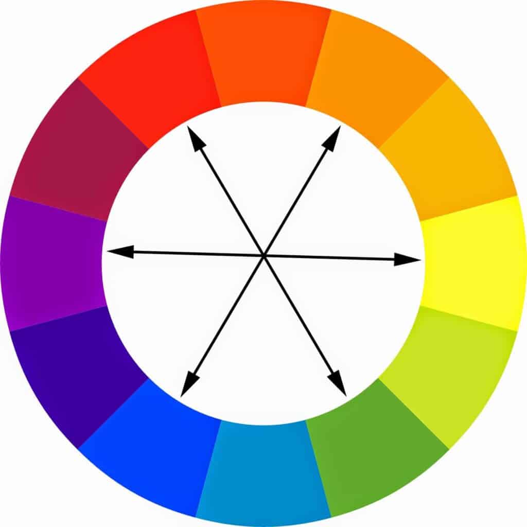
First and foremost, colour combinations can be used according to colour theory in several ways—for example, monochromatic schemes, analogous schemes, complementary schemes, and others.
These schemes are built around how these colours interact within a colour wheel and how the tones, tints, and shades of these colours look when compared to one another. From there, we find patterns in colour usage that convey different meanings, feelings, and levels of subjective appeal.
Monochromatic Color Schemes
These colour schemes are built around one colour and then use different tones of that same colour in various design elements.
Analogous Color Schemes
Alternatively, analogous colour schemes feature three or more hues of colours that are next to each other on the colour wheel.
Complementary Color Schemes
And finally, these colour schemes consist of contrasting colours and hues that help to marry them. You will often see these colour schemes showing two contrasting colour wheel colours and lighter or darker shades in between.
What Are Some of the Ways You Can Use Color in Your Designs?
The psychology of colour is essential to understand from a design perspective. Specific colours may look gorgeous next to one another, but they can evoke emotions that might not be what you are aiming for with your design.
Let’s review some colours that can make or break your designs with unintended meanings. Learning the meanings of colours will also help you to make intentional colour psychology choices in your plans. However, these colour meanings are subjective and different cultures can have other associations. Use these as guidelines rather than rules.
Red
Colour associations with red might seem obvious, but there is more than meets the eye when it comes to red. Its intensity is associated with anger, passion, danger, or a need for action. In this way, the colour psychology surrounding red can be pretty convincing regarding marketing.
YouTube, McDonald’s, and Coca-Cola rely on red for their brand design. With this branding, your attention is immediately grabbed by their logos and their websites. Using red and its shades in your designs can help your site visitors feel excited about your website, but too much of this colour could alarm your visitors.
Orange
With orange, you can use this colour to also grab attention, much like red. However, orange is typically considered a “fun” colour and less commanding or urgent than red. There is enthusiasm incorporated in the color which is why orange is the choice of brands that want to appeal to younger crowds.
Candy brand Reese’s and children’s television channel Nickelodeon incorporate the colour orange into their designs to establish this youthful feel. When trying to avoid too alarming colours, you might want to choose orange as an alternative to red in their designs. Lighter shades of orange can signal less of a need for urgency and more of a playful feel.
Yellow
Apart from red, yellow might be the following most recognizable colour meaning. The colour of the sun, yellow, is associated with happiness. Sunny, cheery, and joyful, the colour yellow contains hope and promise for good times ahead.
From a branding perspective, the colour yellow can also demand one’s attention, especially when the colour is paired with darker colours or other primary colours. We can think of many examples of this in popular brandings, such as the Pokémon franchise, IKEA, and even the Superman logo. Each of these brands tries to inspire joy and happiness and sell it to you through good colour design.
Green
When discussing the colour associations with green, it’s important to note that Americans, particularly, pair green with money and wealth. This association also follows with other countries, but the connection comes from nations with green currency.
Otherwise, universally green is paired with nature. For companies with marketing associated with natural products, green has a powerful connection for branding. Popular American grocery store chains Whole Foods and Publix use green in their branding to display the freshness of their food. At the same time, upscale brands Lacoste and Land Rover show off their status and wealth associations with green.
Blue
A popular colour choice for branding is blue due to its correlation to trust, calmness, comfort, and, most importantly, relaxation. For this reason, blue seems to be one of the most popular colour choices for branding and design.
Designers and brands use this colour to instil harmony and trust without having to prove themselves to their clients. Many major tech companies, such as Facebook, Twitter, and Skype, use blue to establish this trust. When using this colour in your designs, you can help convince your visitors of your reliability and safety when they visit your website.
Purple
Finally, on our list of primary and secondary colour associations is purple. The connections between purple and psychology include luxury and royalty, and other traits include wisdom and arrogance.
For this reason, brands and designers use this colour sparingly to avoid being perceived as “above” their clients. Yahoo is an example of a major brand that uses the colour purple, but other high-recognition brands are more difficult to come by. Purple is a great colour to use in small doses, and lighter tones can help reduce the perception of arrogance in your designs.
The Best Colour Tricks for UI Design
Contrast is Helpful
Using colour schemes with contrasting colours will help improve your website’s readability. With too many colours that blend into one another, you may risk your visitor feeling like they don’t know what to look at on your website. Items, logos, and fonts may blend into one another and leave your visitor confused and ready to go to another website.
Monochromatic palettes can be used in UI design but should be used carefully and tested for readability. Font colours should default to black or white if possible to help encourage this contrast in your designs. You should also consider using these neutrals to help create space in your plans not to overwhelm your viewers.

Use Tools to Help You Pick Colors
The untrained eye can need help choosing colour palettes, and in fact, this is why some designers choose to specialize in colour theory. Otherwise, designers can use tools to help them select colour schemes that appeal to their audience and follow the “rules” of colour theory.
One of our favourites is from Adobe; the colour wheel function allows you to play with various colour schemes. You can select a colour from a brand’s logo and create palettes of colours that surround that primary colour in varying colour schemes. Very good alternatives to it are Coloors and the Canva Color Palette Generator.
Many options are available to you, including analogous, monochromatic, triad, complementary, and more. Using Adobe’s colour wheel feature, you can create a fully custom colour palette surrounding one or more existing brand colours.
Conclusion
To conclude, color theory is integral to website design, and choosing the correct colours can help you to convey your brand message with an additional level of innovation. Colour is challenging to master but is essential to your branding. As we mentioned, colour is something that some UI designers even choose to focus their careers on entirely, and its meanings can be subjective. The meanings of the colours in this post are merely a representation of an average perception of colours.
Do you have questions about colour theory and design for your next UI project? At UI Rocket, we would be happy to help you by providing our expertise in creating colour palettes for UI design.